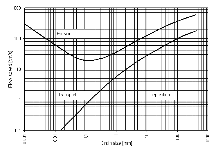
I was working my way through the Fluvial Hydrology portion of the A-Level geography syllabus and the Hjulström Curve once again imposed itself on my Friday frazzled brain. As a basic tool for understanding whether a river will erode, transport or deposit sediment, it is does its job. We were taught the same diagram when we were at school. However I am not sure if there is an understanding of what the various axes represent, so I thought I would go on a little adventure.
When we were undergraduate students, we were taught much of our sedimentology by an amazing man called Mr McCarthy. He is no longer of this world, bless him, but we were privileged to have had him as a teacher. Now as part of our course we had to collect sediment samples, sieve them in the laboratory, and plot graphs of the results.
The sieving process goes something like this. The soil sample is oven dried and weighed – and gives us a result of say 2.15 kg. The sample is then placed on a stack of sieves – all with different sizes, with the sieve with the largest aperture at the top, and the smallest at the bottom. Back in the day we had to shake that stack of sieves by hand, but now there are machines that do the shaking for you.
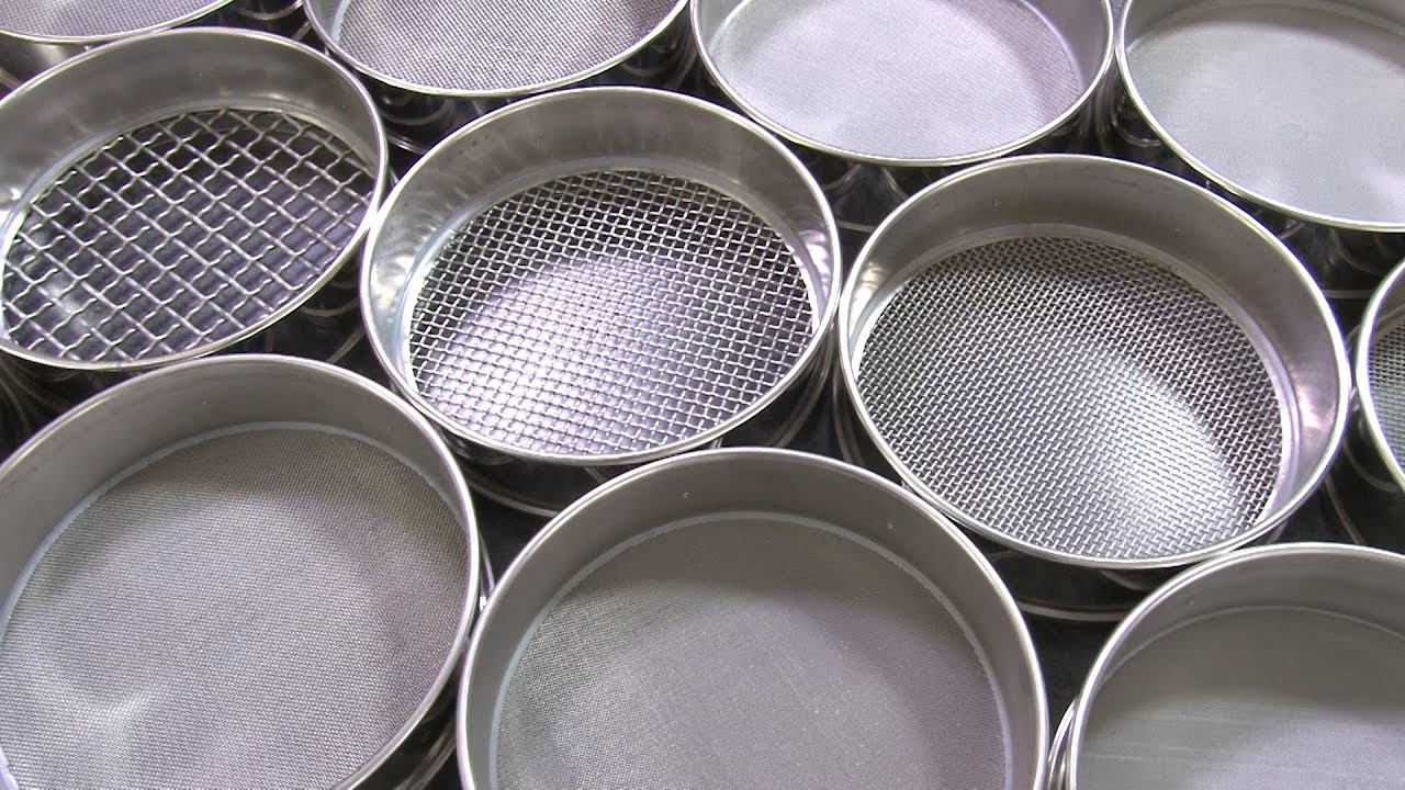
The sieves themselves comply with various standards – British Standards (BS), American Society for Testing and Materials (ASTM) and International Organization for Standardization (ISO) to mention the obvious ones. The size of the sieve apertures are generally very similar between the standards.
Once the moving and shaking is done
Once the moving and shaking is done, the sediment (soil) retained on each sieve is weighed and a table compiled with the sieve size (which equates to the particle size) and the weight of the soil retained from each sieve. Dividing the weight of the retained soil on a specific sieve by the weight of the total sample, and multiplying it by 100 gives the percentage retained on each sieve. So with this data a graph of percent retained against sieve size can be plotted. It can also be plotted as percent passing a given sieve size.
It will be impossible to separate out the clay
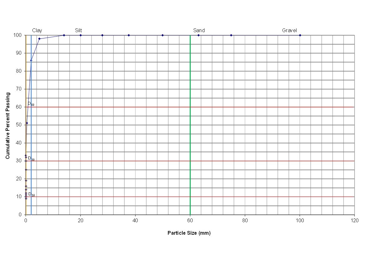
But now a problem arises – if a soil comprises a range of grain sizes from clay to cobbles, how on earth do we plot this on a graph, bearing in mind that the grain size of clay is less than 0.002 mm, and a cobble can be up to 100 mm, if not larger. By plotting our data where our X-axis ranges from 0.000 mm to 100 mm on a standard graph, and if for example 51 percent of the sample comprises clay, 5 percent silt, 30 percent sand and 14 percent boulders, then the graph is going to be pushed so close up against the graph origin that it will be impossible to separate out the clay and silt fractions. I have plotted a graph below to illustrate the problem,.
Our problems were solved in a very elegant way
So how do we get around it? Well, thanks to Mr McCarthy, our problems were solved in a very elegant way. The solution is to plot the data on semi-log graph paper. Which I know may scare you by sounding very mathematical, but it really is very simple. (We used to plot things onto graph paper back in the day, and I would still recommend it now as it is a hands on, tactile way of learning. Excel will do it for you too, but it’s not quite the same.)
There really are some clever people out there
The solution is elegant because each successive subdivision along the X axis is ten times larger than the previous, which allows for the data to be ‘stretched out’ so that we can see what is going on. So the first division ranges from 0.001 mm to 0.01 mm, the second from 0.01 mm to 0.1 mm, the third from 0.1 mm to 1 mm, the fourth from 1 mm to 10 mm, and the fifth from 10 mm to 100 mm. The exact same data can now be seen quite clearly as shown in the figure below. Quite amazing really. There really are some clever people out there.
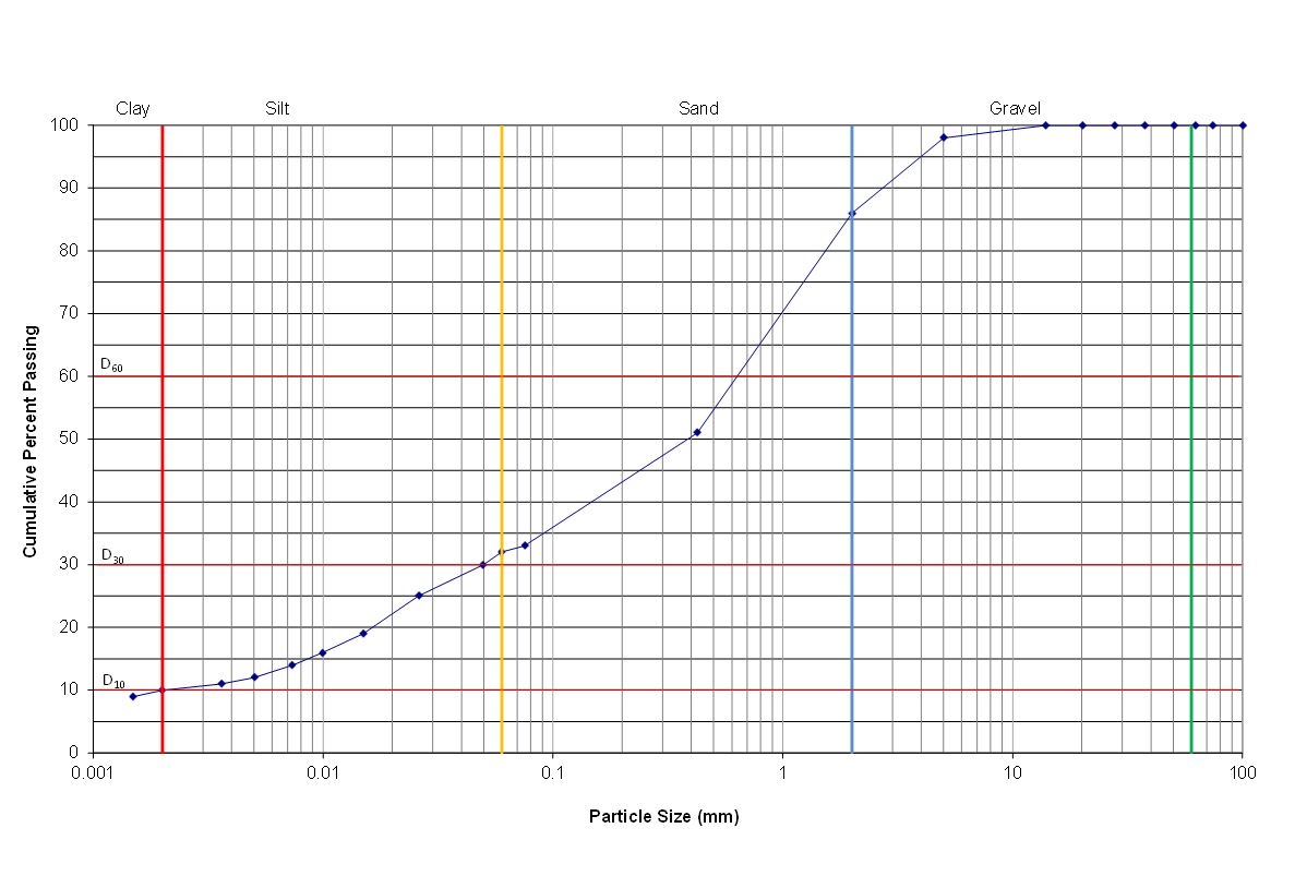
Any soil scientist, engineer, sedimentologist, hydrogeologist or hydrologist will tell you how useful these plots are – they are generally called ‘particle size distribution’ plots because they show the distribution of the various soil fractions very graphically. All sorts of useful information can be derived from these plots, and perhaps I will talk about these at a later stage.
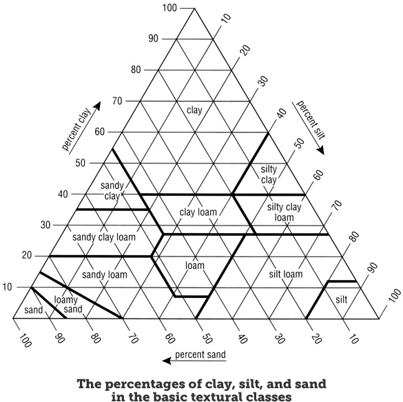
The same percentages derived from the sieve analysis can also be plotted on Ternary Diagrams, which then allows them to be classified as silty Clay, or Loam, Sand and so forth in a very intuitive way.
To conclude, if you look carefully at the X-axis on the Hjulstrom Curve, you will see that it is also a log scale, which is exactly the same as the scale I have just discussed. The Y axis is also a log scale, used for the same reasons given above – allowing the us to draw out the data so we can see what is going on. This kind of graph is called a log-log graph, compared to the PSD graph which is plotted on semi-log paper.
Hopefully you will look at those Hjulström Curves in a new light, now that you have some insight into how it has been derived.
Sign up to stay informed when we launch new courses or haul you along on wonderful adventures.
A promise - no spam, no nonsense, no passing on of your details
If this resonates with you and you think it may be valuable to others, please share.

