Ahead of its time when it was published, a boon for navigators when they eventually bolted down the problems of determining longitude, criticised for its distortions, it is still the most popular projection used today, and almost every map of the world showing the distribution of the land masses and oceans utilises this method. Find out how this genius insight made everyone's lives a great deal easier. >>>
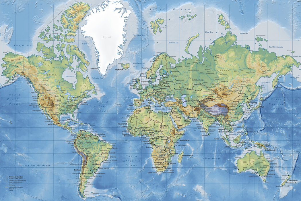
Mercator Projection of the World
Whilst preparing the Mapwork courses for Rock and Sky, I have been trying to plot a route which takes us through the requirements of the syllabus, but also brings the subject to life. Having done Survey 101 at university, and lived around maps and surveyors ever since, I have had an ongoing interest in cartography and geodesy. In fact some of the great discoveries of the earth sciences were thanks to the great trigonometrical surveys of the 18th and 19th centuries.
Ahead of its time, but a boon for navigators
A quick Google search on the history of map making throws up a bewildering pile of information on mapmakers from China, Arabia and Europe. It is a fascinating read if you have the inclination and the time, but with a great deal of work ahead of me I didn’t have the luxury of tacking this way and that to explore these fascinating waters. What I needed was information on the maps and projections that we have to teach in the school syllabus, and one of the most famous, perhaps the most famous, is the Mercator Projection. Ahead of its time when it was published, it was a boon for navigators when they eventually bolted down the problems of determining longitude. Although it was criticised for its distortions, it is still the most popular projection used today, and almost every map of the world showing the distribution of the land masses and oceans is a Mercator Projection.
The distance between a line of longitude varies
The Mercator Projection shows lines of Latitude and Longitude at right angles to one another – if we look at a Mercator Projection map of the world, we will see that this is so. But remember that Earth spins on its axis, with the North Pole at the top and the South Pole at the bottom. Also remember that all the lines of Longitude converge on the poles. So the distance between a line of longitude varies from 111 km (69 miles) at the equator, to 0 km at the poles.
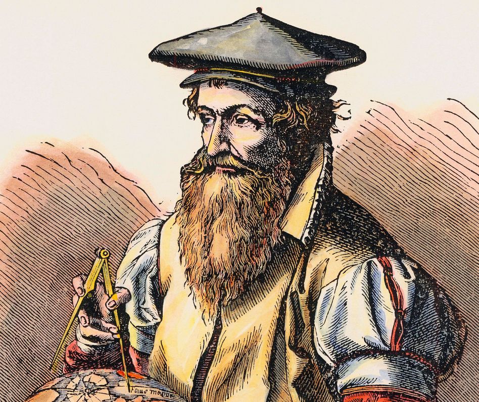
Gerardus Mercator
Mercator’s genius was that he was able to come up with a projection that ‘stretched’ the map at the top and the bottom, with the amount of stretch increasing proportionally as we move north and south, or to what is known as higher latitudes. Increasingly higher in terms of the degrees – 0 degrees at the equator and 90 degrees at the poles.
The great challenge for any map maker is how to represent an essentially spherical Earth on a flat sheet of paper. A number of map makers have taken up the challenge, but it was Mercator who came up with arguably the best solution, which is why it is used to this day, and which is why the projection bears his name.
On constant lookout for hidden reefs
By stretching things proportionally, the lines of longitude were always orientated north-south, the shape of the land masses remained correct, and it was now possible for navigators to plot a course on their chart, and sail that course using a compass until such time as their destination hove into view. Well, that was the general idea, but life is never that simple – ocean currents drove ships off course, storms did likewise, and of course those earlier seafarers had to be on constant lookout for hidden reefs and low-lying islands or atolls. Little wonder that there were so many shipwrecks back in those early days.
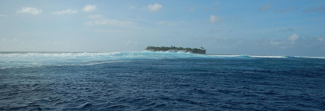
A low-lying atoll in the Marshall Islands. Running aground on an atoll in the dead of night or during a storm would be nothing short of disastrous.
Source: USGS
But for navigators, Mercator’s maps were a real boon – they could plot courses and navigate their way across oceans with much greater confidence than before. One of the problems they did have though was an inability to calculate longitude. It was simple enough to get the latitude based on the height of the sun and stars above the horizon, but the longitude calculation required an accurate clock to determine the local time at noon whilst at sea (or on land for that matter) which was then compared to the time at a known longitude – which generally was that of Greenwich.
They became totally unreliable
Now is not the time to dive into the intricacies of navigation, but suffice to say, it was only in 1762 that a suitably accurate chronometer was built that kept accurate time at sea. Up until then all the clocks that had been taken on voyagers lost or gained time and became totally unreliable.
One of the peculiarities of sailing a compass bearing on a map produced using Mercator’s Projection is that the route sailed is not actually the shortest route. Crossing lines of longitude at the same angle, which is what happens when sailing a compass bearing, actually produces a ‘spiral’ route. Check out this Wikipedia image showing how this works. For relatively short voyages this doesn’t make that much difference, but for modern, long haul flights from one side of the globe to the other, this can add a considerable distance to the journey and pilots now fly what are called ‘great circles.’
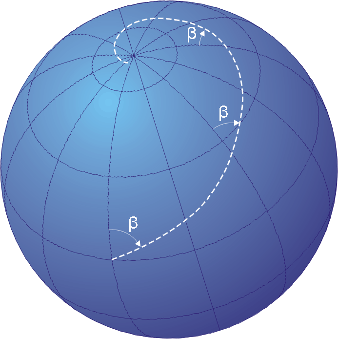
The actual route sailed if you were to follow a compass bearing on a Mercator Projection Map. The route in white intersects the lines of longitude at the same angle - which is the compass bearing - but because of the distortion inherent in the projection, it actually causes you to sail a spiral route, which will eventually take you to the pole if you sailed far enough and the ice didn't get in the way.
Source: Wikipedia 2021
In spite of the issues around determining longitude, and the fact that the plotted routes of ocean voyages were not necessarily the shortest routes, Mercator’s projection caught on and became the ‘go-to’ map projection for cartographers ever since. Another disadvantage of the Mercator Projection is that is stretches out the land masses in the north and south, so that Britain for instance is shown disproportionately large compared to Africa, which straddles the equator.
A light at the centre of the Earth
I have borrowed an image from Encyclopaedia Britannica to illustrate the mechanics of the projection. The mathematics we don’t want to get involved in, but the idea of a light at the centre of the Earth projecting the intersections of the lines of latitude and longitude, as well as the outlines of the land masses onto a flat sheet of paper wrapped around the globe is a fantastic way of illustrating how the projection works.
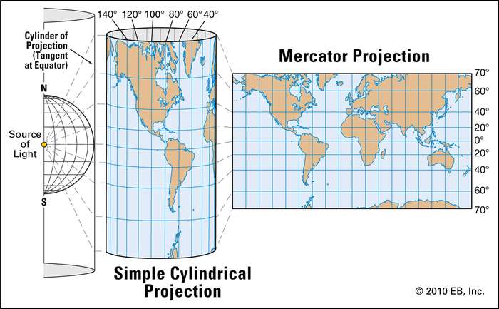
Imagine a source of light at the centre of the Earth, projecting outwards onto a sheet of card wrapped around the globe. The intersection of the lines of latitude and longitude can then be marked up onto the card, as well as the outlines of the land masses, and once unrolled the projection will be as shown on the right-hand-side of the figure.
Source: Encyclopedia Britannica 2020
We owe Gerardus Mercator a debt of gratitude for his insights and hard work in creating his map that was gifted to the world in 1569. Well done Gerardus Mercator.
Leave your comments and requests in the comments box below. We would love to get your feedback on this and other things geographical.
Leave us your best email address so that we can keep you updated on when we launch our Mapwork Course
The study and making of maps is called cartography. And cartography course will be devoted to introducing you to the concepts that underpin the discipline, as well as looking at case studies and how maps have enormously influenced our world.
Leave your name and best email address so that we can inform you when we launch our Mapwork course. We are working hard at getting it done, and there is a huge amount of work ahead of us in terms of researching, filming and editing. Leave us your best email address so that we can keep you updated on when though, which is the main thing, and we want to share that fun with you.
A promise - no spam, no nonsense, no passing on of your details
If this resonates with you and you think it may be valuable to others, please share.


I really love maps and teaching using maps but sometimes the rules and methods get in the way of making maps interesting and fun. I’m looking forward to your course and passing it on!
Kate. Thanks for dropping by and leaving your comment. We are going to have some fun here – loads of grand stories about mapmakers, adventurers and how we got to be where we are in terms of our understanding of our world. Stay tuned.